Building Trust through Design

Homepage redesign for a nonprofit to clarify its value proposition & rebuild trust.

The Project

Homepage redesign and creation of a scalable design system for a Guatemalan organization that supports NGOs.

My Role

Product Designer (UX/UI), leading research, information architecture, interface design, prototyping, and the creation of a modular design system.

Key Outcome

The project resulted in a consistent design system and a high-fidelity prototype, delivered with a detailed handoff for development—laying the foundation for a clear, coherent, and scalable user experience.

Client

This project was for a Guatemalan NGO that helps other nonprofit organizations grow and professionalize through courses, consulting, and accreditations. It also connects donors and companies with an exclusive database of trustworthy entities that have successfully completed its evaluation process.

Initial Problem

The existing website presented two major obstacles:

  • A lack of trust toward Guatemalan NGOs and the organization’s own evaluation team.
  • A confusing information architecture that did not clearly differentiate between resources for NGOs and donors, leading to user drop-off.

Objectives

  • Convey transparency and credibility (clear content about evaluations, team, and methodology).
  • Differentiate resources for distinct audiences (donors and NGOs).
  • Reflect the organization’s new mission and vision.
  • Improve the user experience and eliminate dead ends in navigation.

DISCOVER

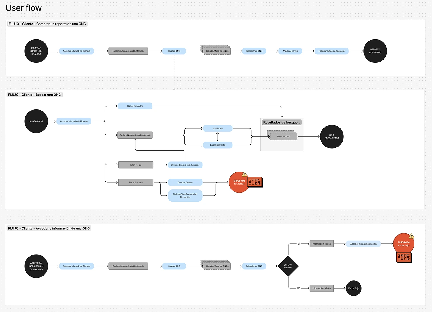
Diagram mapping the user flow through the organization's original website, highlighting the navigation bottlenecks found during research

User Flow

I mapped the website’s user flows to identify the steps required to complete key tasks and uncover areas for improvement. The analysis revealed severe bottlenecks: in some cases, users were unable to complete the task at all.
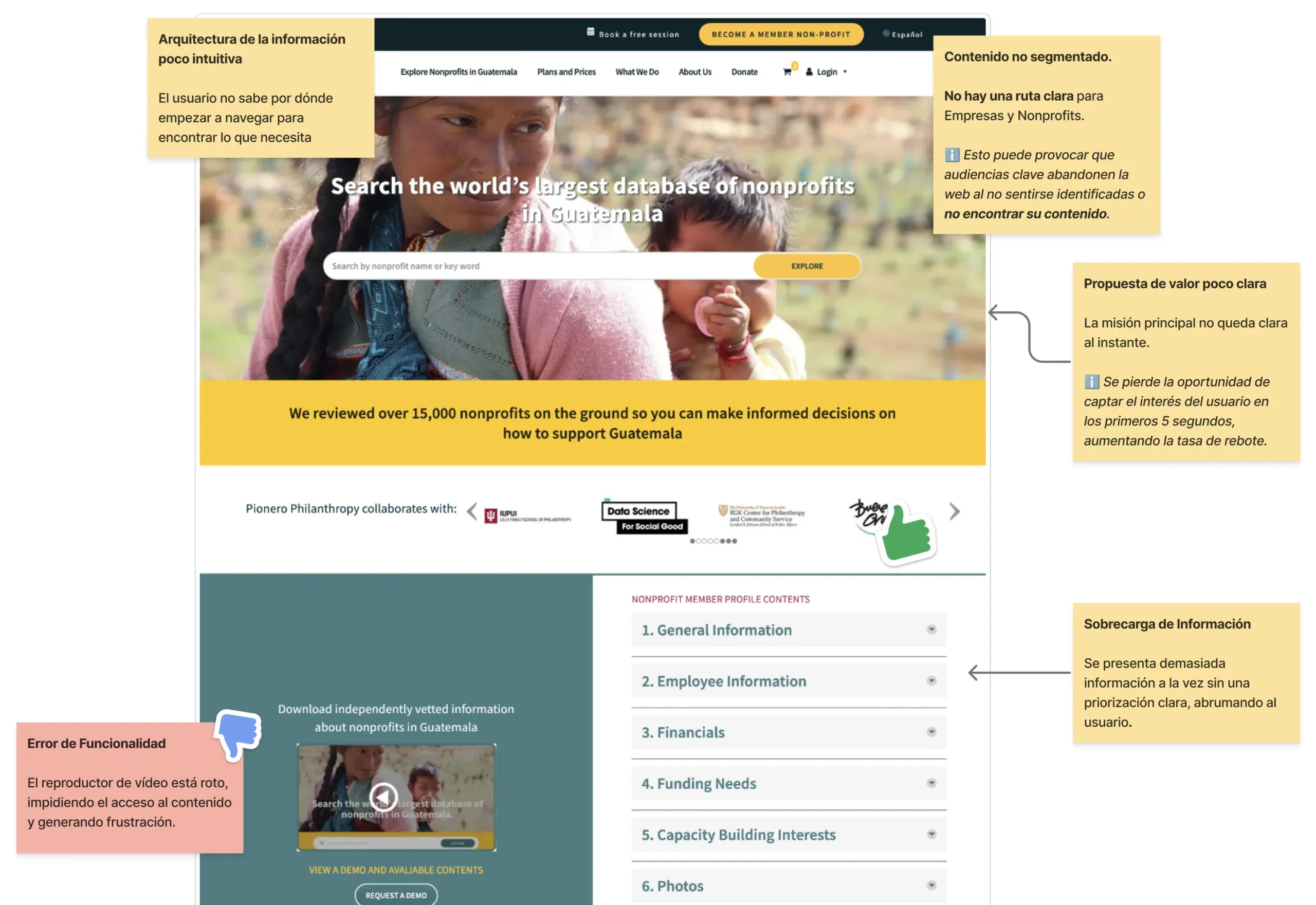
Annotated screenshot of the organization's original homepage showing usability issues identified in the heuristic evaluation

Functional Audit & Heuristic Evaluation

Based on the issues found in the user flow, I reviewed the site to detect the most immediate problems affecting navigation and the clarity of the organization's message.

To complement this initial analysis, I conducted a heuristic evaluation using a scoring template to provide an objective usability metric for the interface.
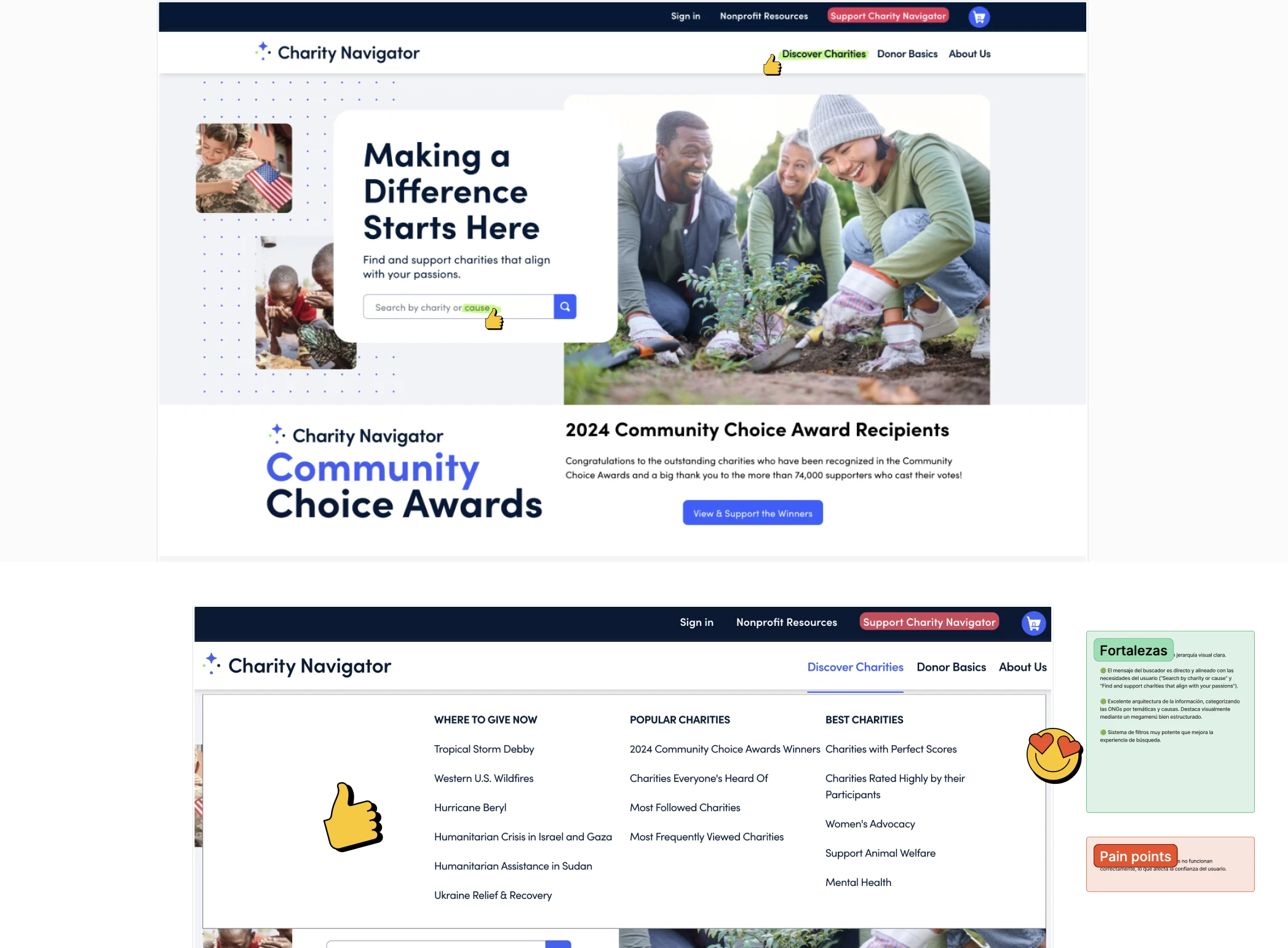
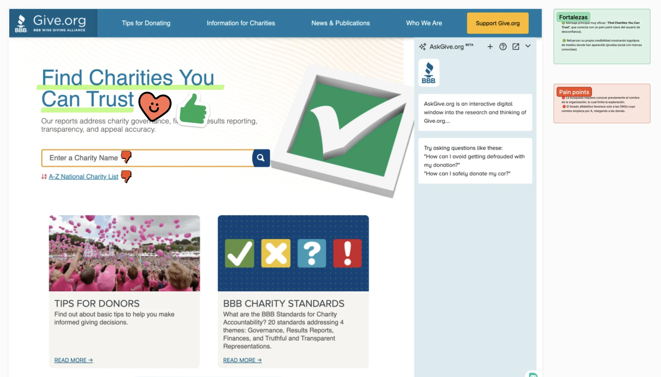
Benchmark

I analyzed similar organizations to identify best practices in:
  • Transparency and impact communication.
  • Clarity of navigation.

Positioning of mission and vision.

Proto-Personas

Since there was no direct access to end users, I developed proto-personas based on information provided by the client’s team. These served as initial hypotheses to be validated in later stages.

Ana (NGO Director)

Daniel (Donor)

DEFINE

Problem Statements

From the synthesis of research, I identified two key problems:

NGOs

Donors

Global HMWs

Trust

Information Architecture

Mission & Vision

DEVELOP

Design Principles & Concept

From the HMWs, I established three guiding principles for the redesign:

Transparency

Highlight methodology, impact metrics, and the evaluation team.

Audience clarity

Create distinct entry points for donors and NGOs.

Mission-driven design

Communicate the organization's vision prominently on the homepage.

These principles guided the homepage redesign, ensuring the solution directly addressed the identified problems.

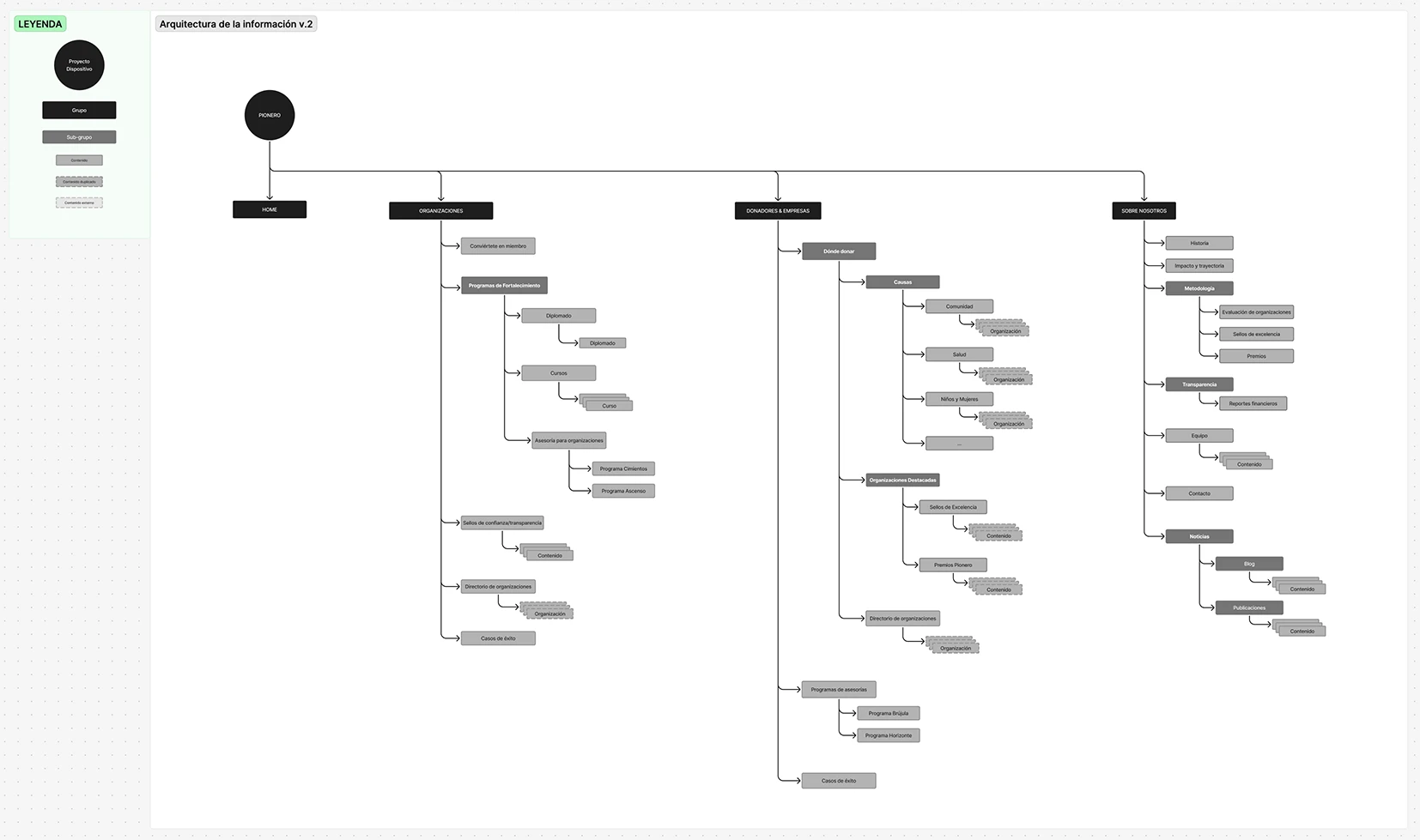
New information architecture diagram separating entry points for donors and NGOs, with mission and vision given more visibility

Information Architecture

I redesigned the IA to clearly separate entry points for donors and NGOs while giving greater visibility to mission and vision.
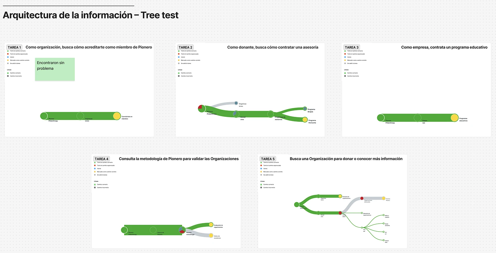
Tree test results chart showing task success rates for the redesigned information architecture

Tree Test

I validated the new IA with a tree test that showed clear improvements in task success rates (e.g., locating evaluation information, finding NGOs by category).
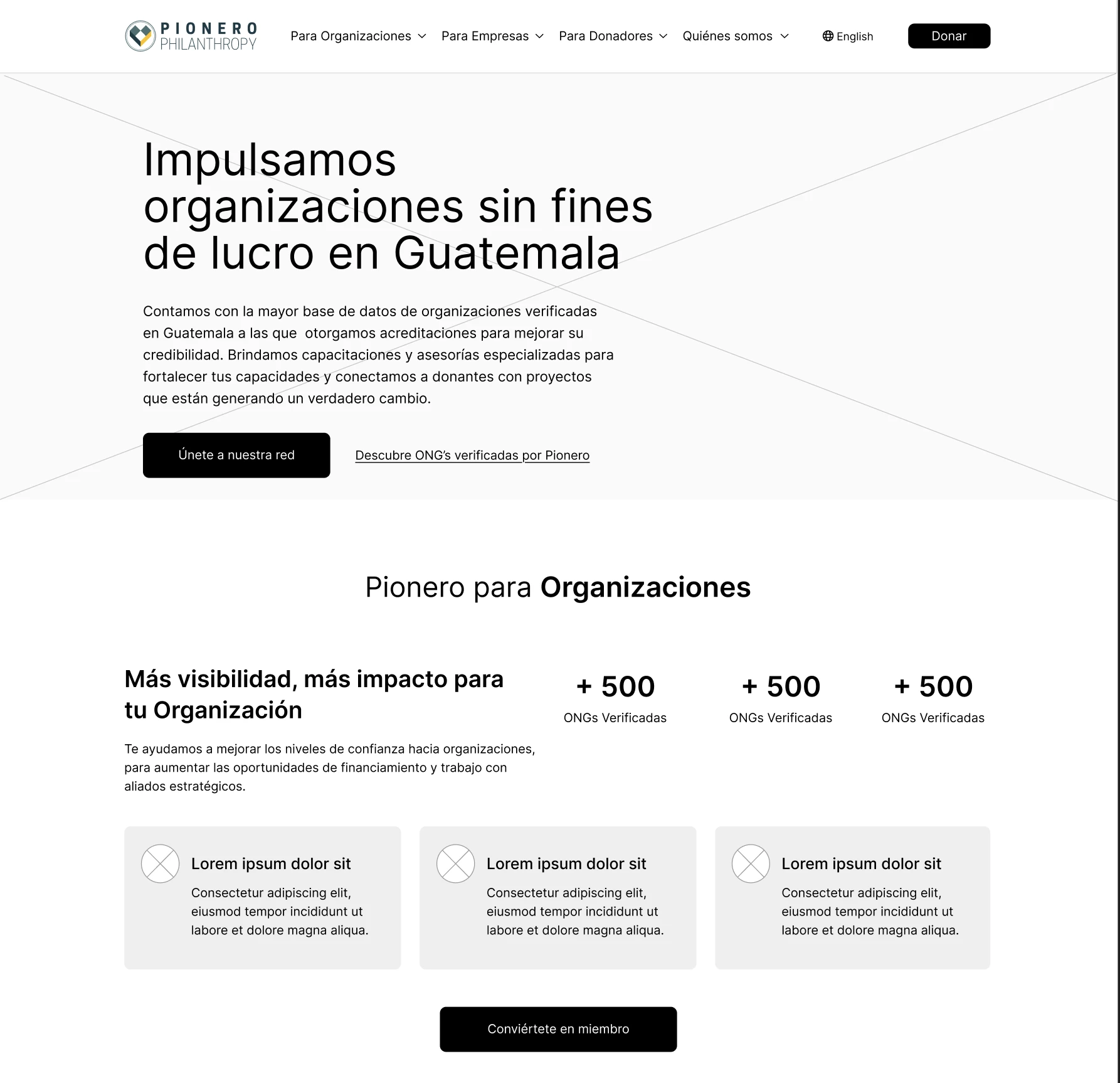
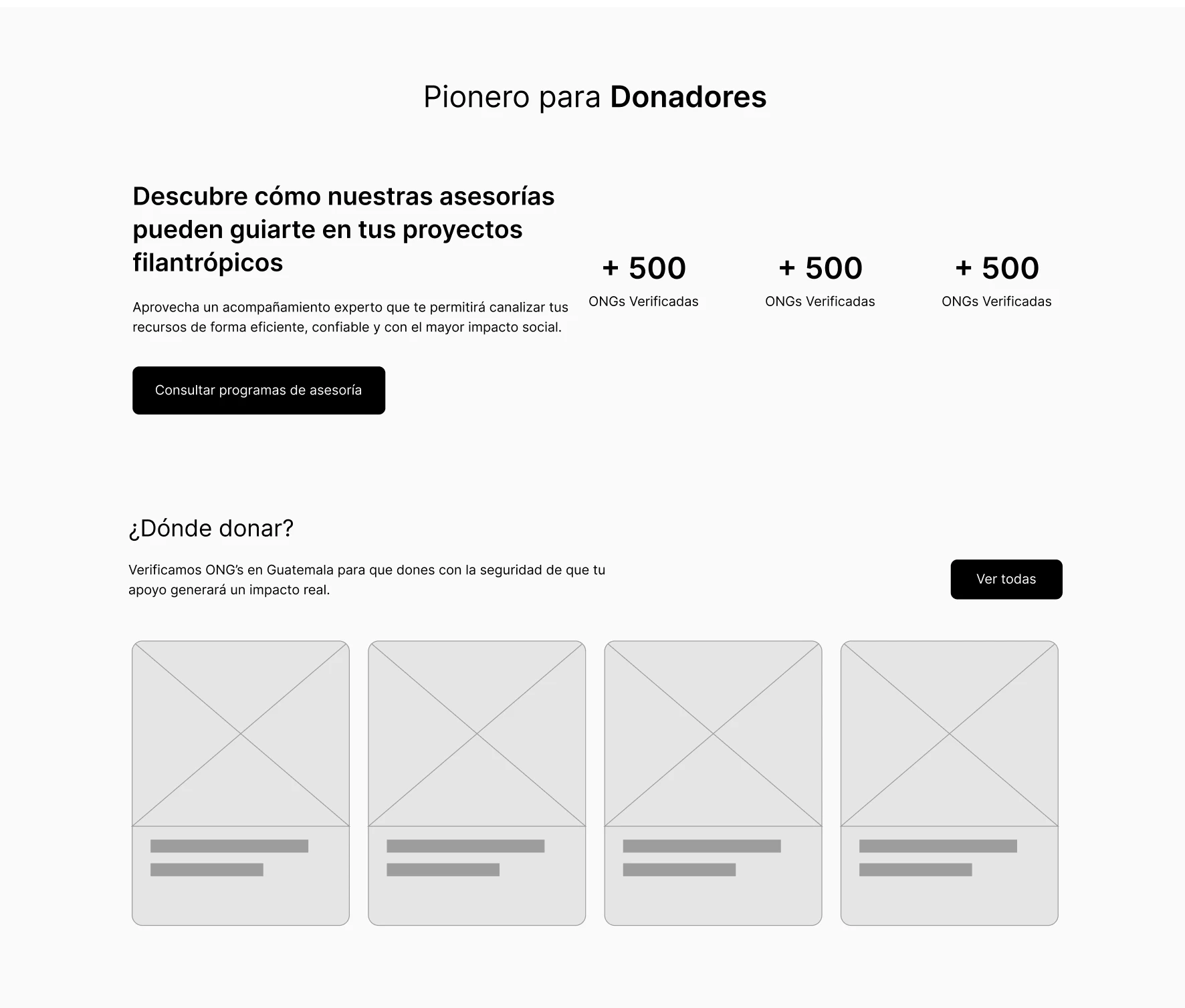
Low-fi Wireframes

I designed low-fi wireframes to test the structure and information hierarchy before moving on to prototyping.

Design System

UI Kit

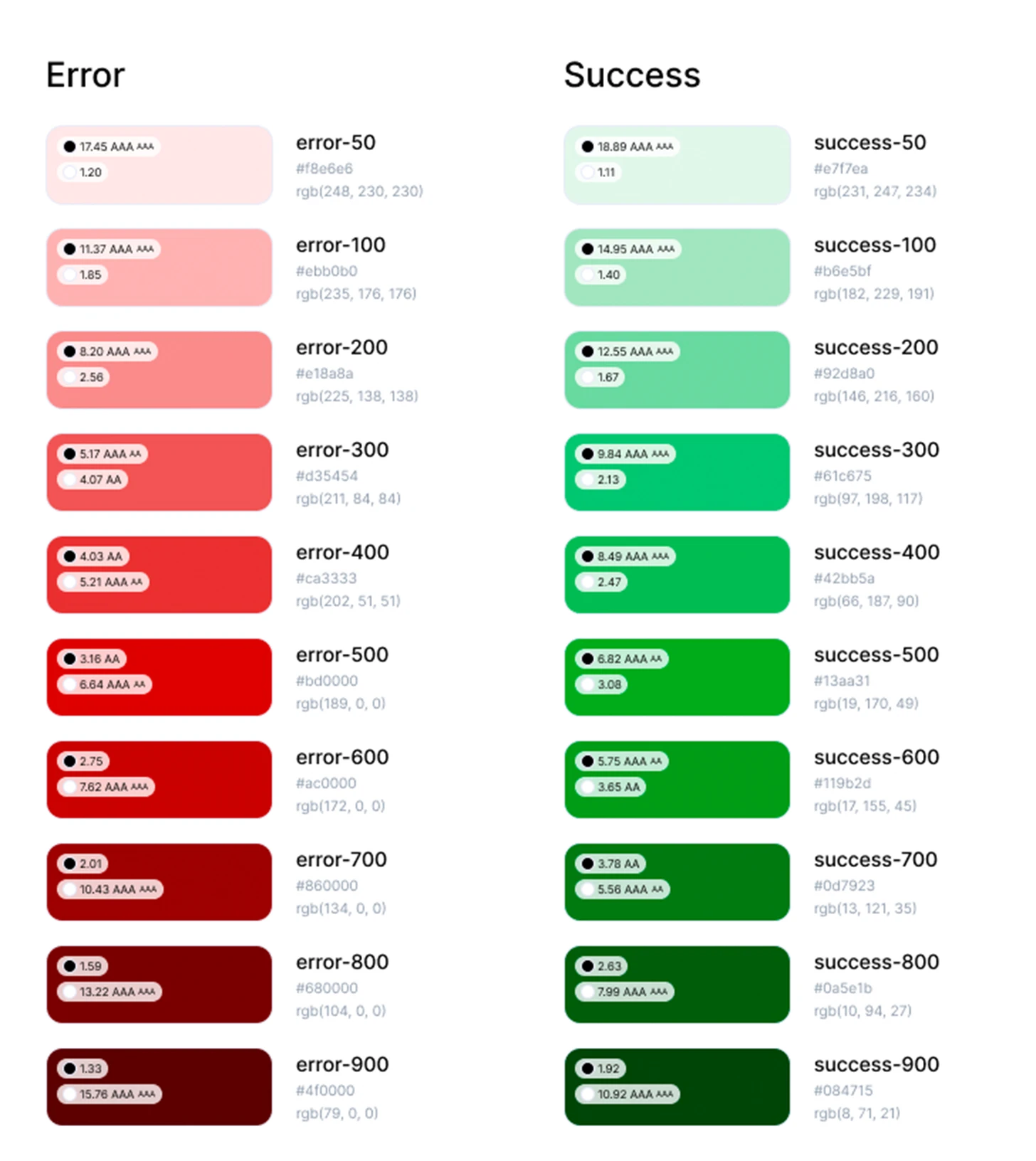
Colors

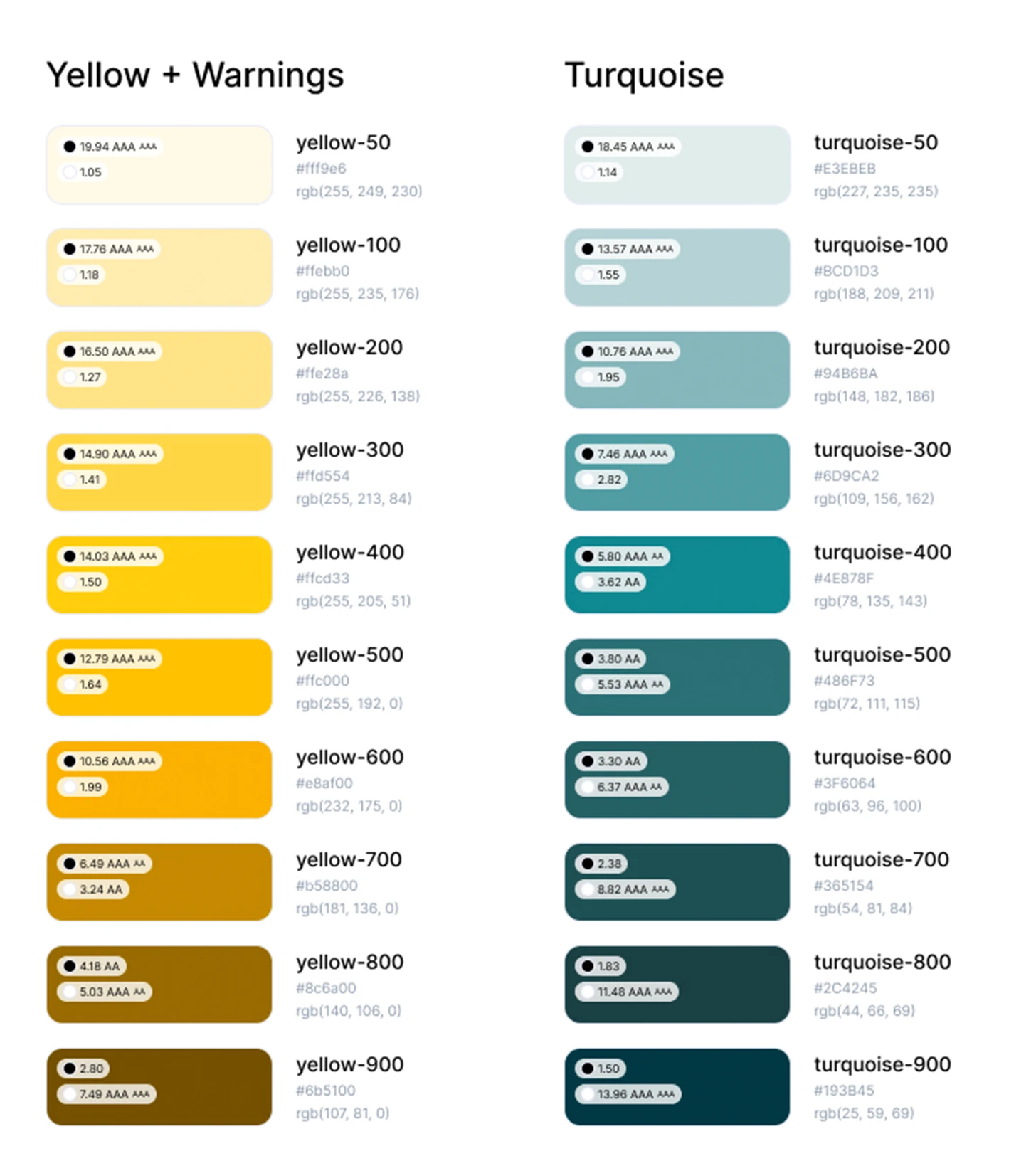
Swatch of the primary yellow brand color used in the design system
Swatch of the secondary turquoise brand color used in the design system

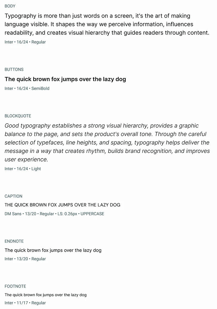
Typography

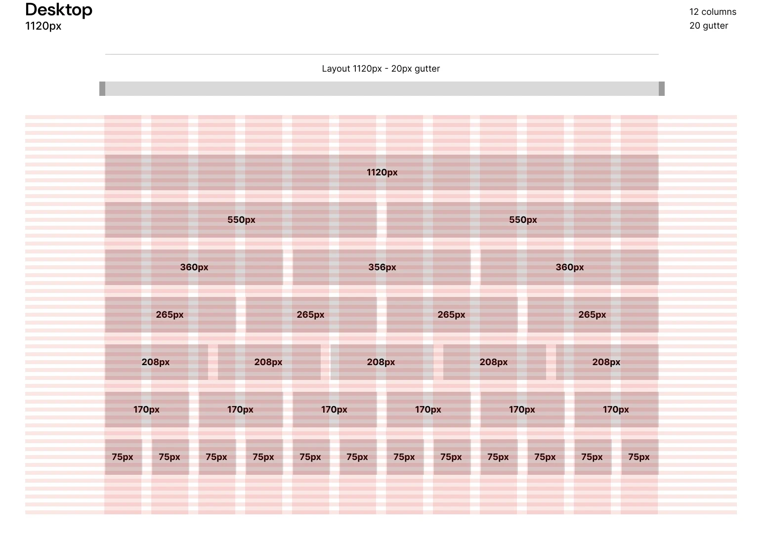
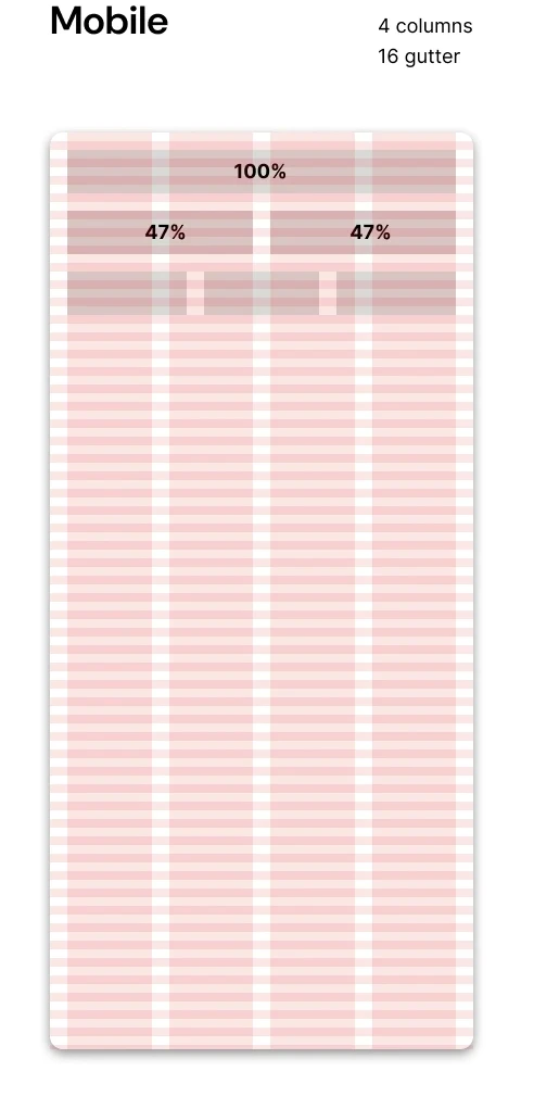
Grids

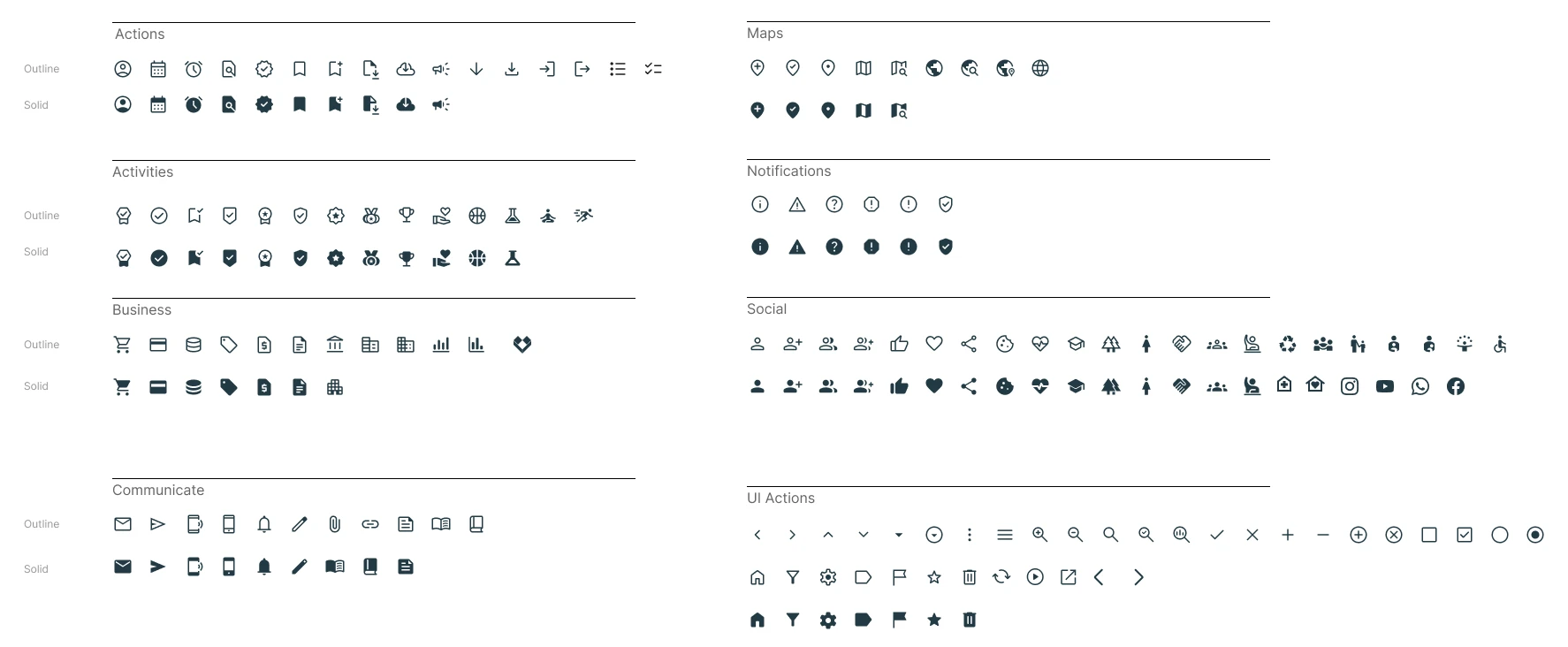
Icons

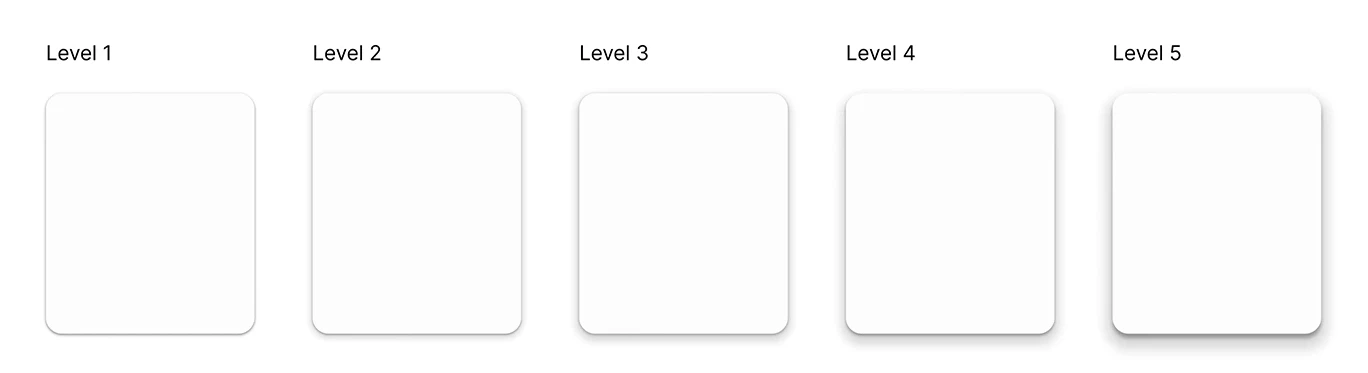
Elevations

Components

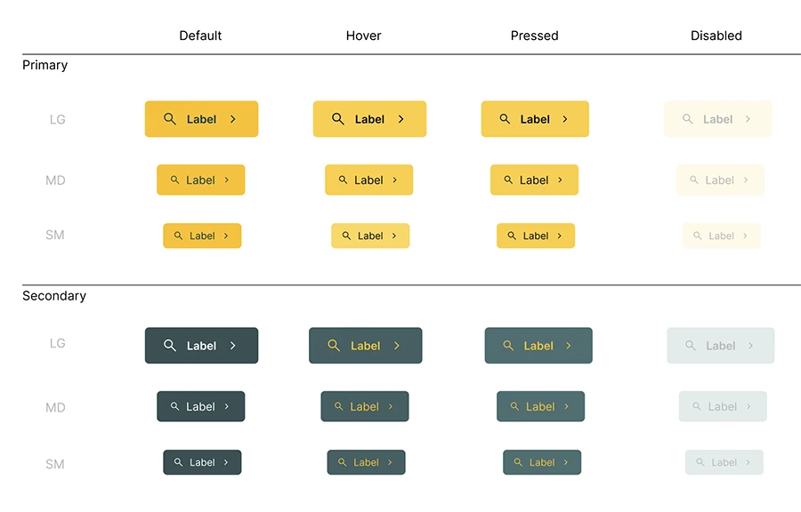
Buttons

Cards

Card component used to display verified NGOs in the organization listing
Card + ONG’s
Card component used to display donor and organization testimonials
Testimonial Card
Card component used within the featured organizations carousel
Carousel Card

Inputs

Form input component states — default, hover, active, focus, error and disabled

DELIVER

Design

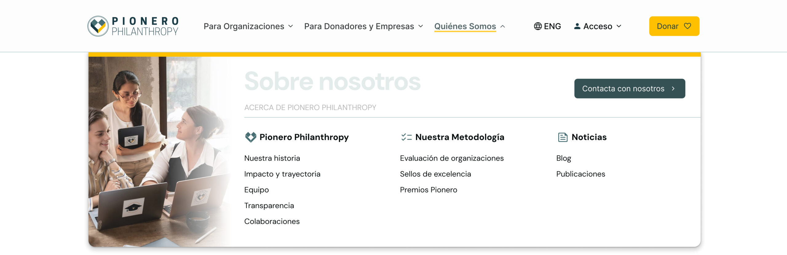
Menu

Desktop
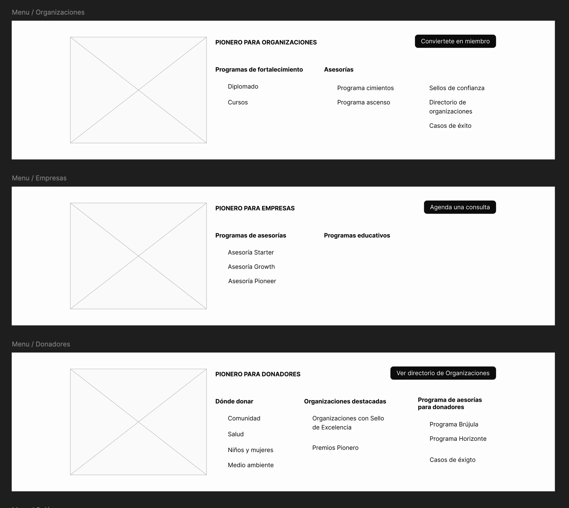
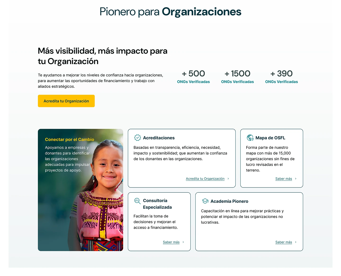
Desktop dropdown menu design for the Organizations section
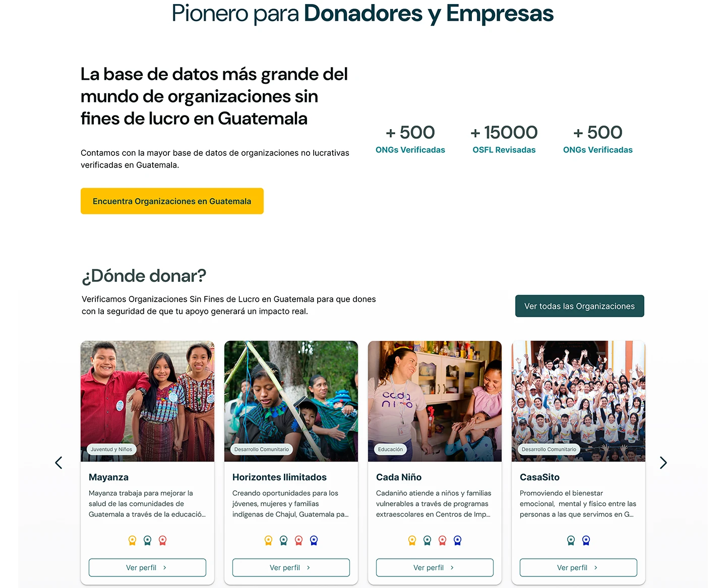
Desktop dropdown menu design for the Donors and Companies section
Mobile
Play Video

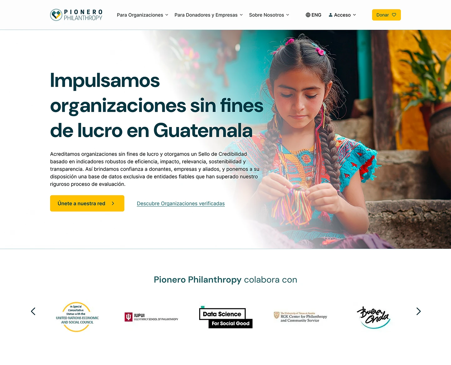
Home

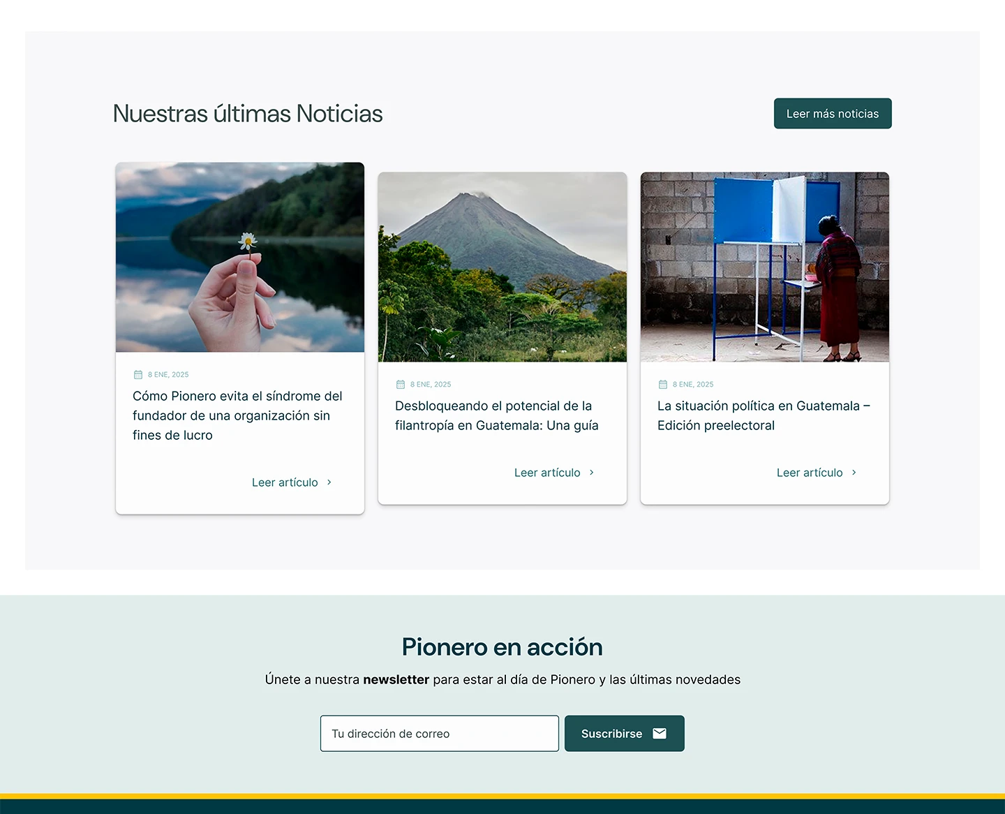
Desktop
Mobile
Plus mobile device
Animated preview of the mobile homepage design for the organization

Post-Launch Reflection

The project’s scope covered the homepage design and the full design system handoff, not ongoing support during development. Even so, before wrapping up the project I walked the project lead and the developer through every page in a dedicated meeting, and stayed available for follow-up questions.

Over time I’ve noticed some details in the final implementation drift from the delivered design, including the layout width, which I actually caught and flagged during the project itself with annotated screenshots. It’s a good reminder that if the scope doesn’t include a post-launch review, it’s worth spelling that out upfront or offering it as a separate service.